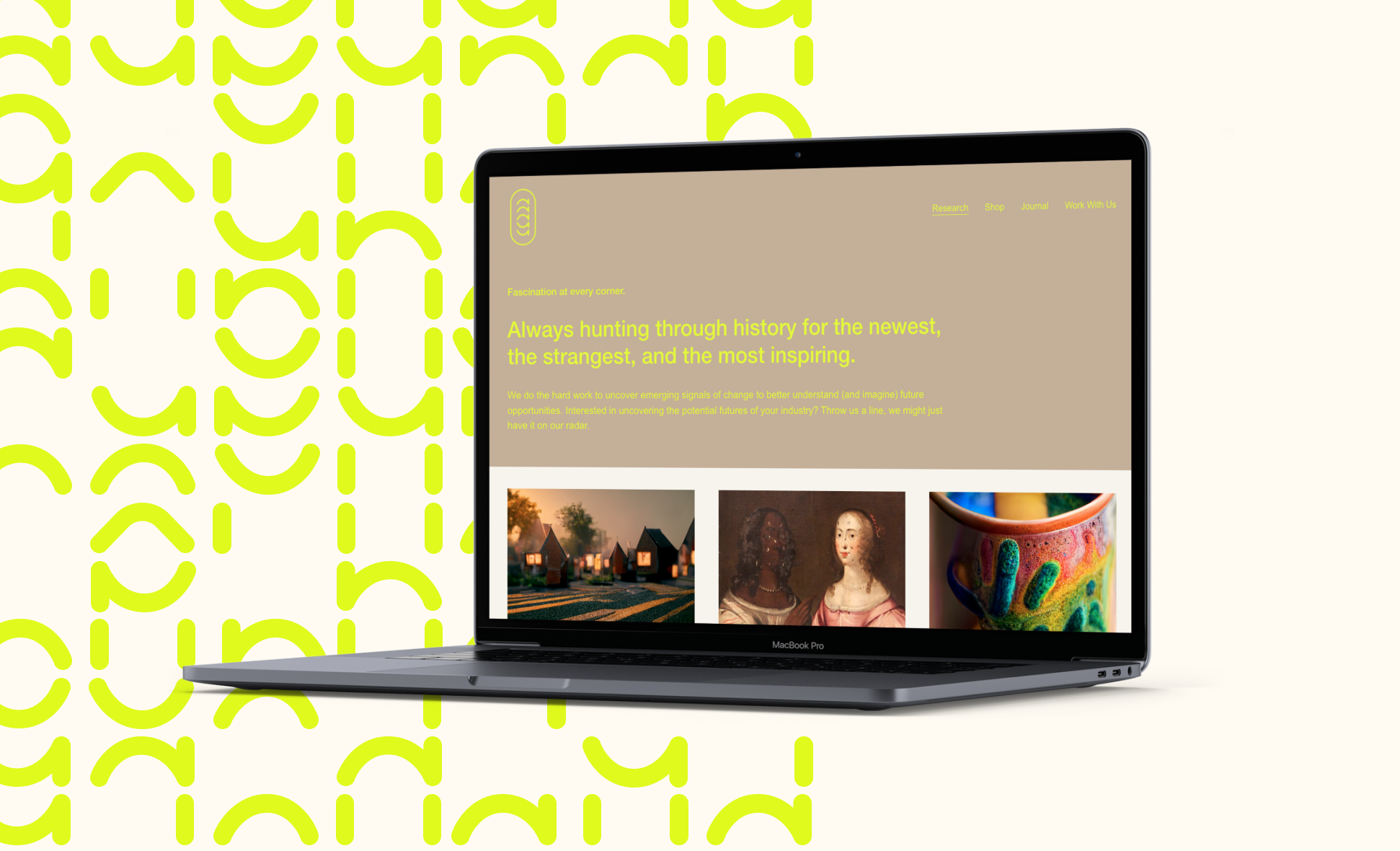
Branding for Avenear that captures the essence of a design futures studio.
For this brand I chose to take inspiration from the fields of industrial design and strategic foresight/futures thinking appraoches.
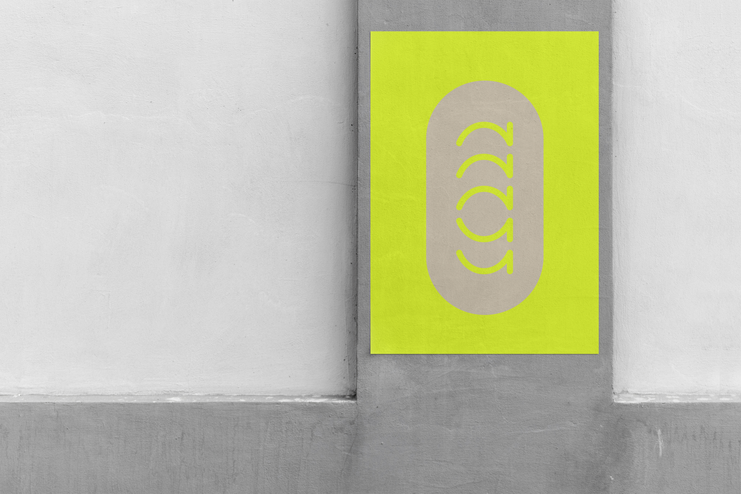
Colour:
The colour scheme represents the intersection of the natural and the synthetic. One colour is familiar, neutral, natural while the other is fluorescent, bright, and surprising.
Logo & Wordmark:
The logo is designed like a stamp that can be added to products, projects, or perspectives. The accompanying wordmark reuses elements of the logo to form the word ‘Avenear’ and form a cohesive set.
Logo Design:
The design of the logo itself blends elements of:
a) a traffic light ( representing a futurist skill of being able to listen and interpret signals),
b) echoes or ripples (representing understanding and investigating implications of change), and
c) a reflected or mirrored element that combines to form new shapes (representing the multiple ways to remix future trends for different outputs)